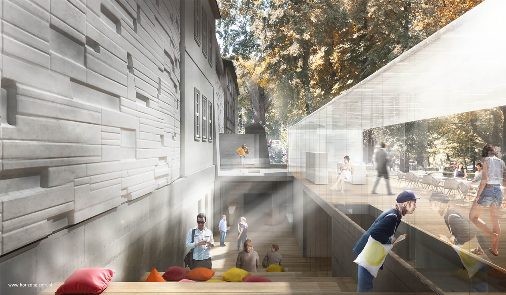
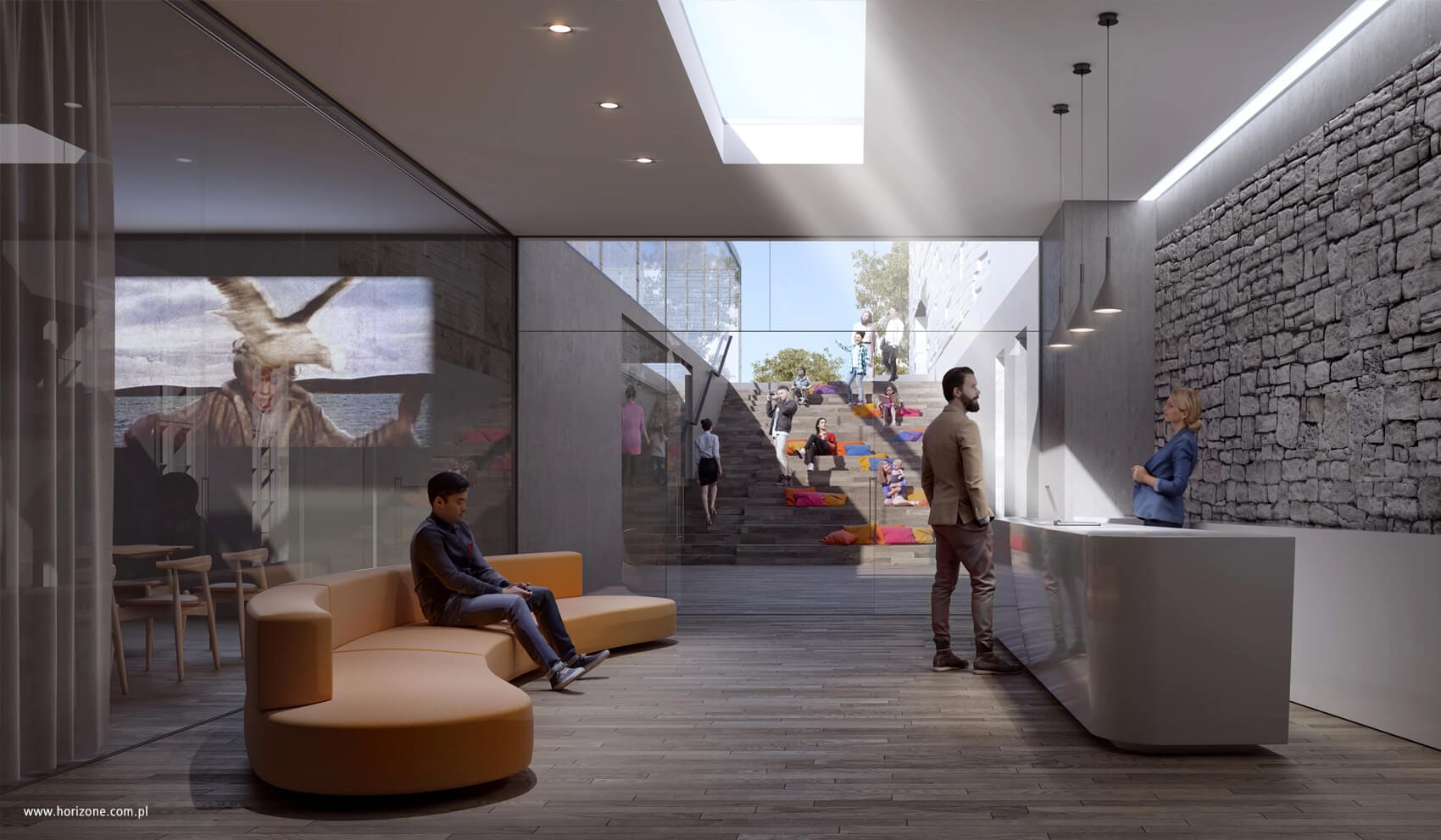
An important part of the underground extension is the external staircase leading from the square in front of the building on Szczepańska Street to the basement level, where a library, bookstore and conference room are located.
This local depression creates an additional, intimate outdoor area and allows a large amount of daylight to enter the representative underground space.
Main assumptions of the concept
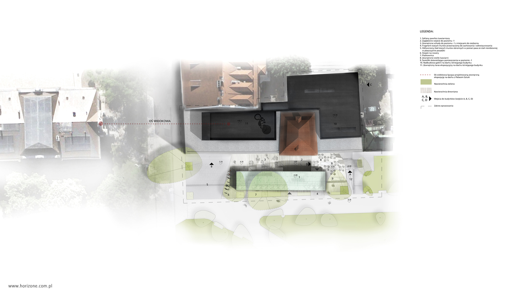
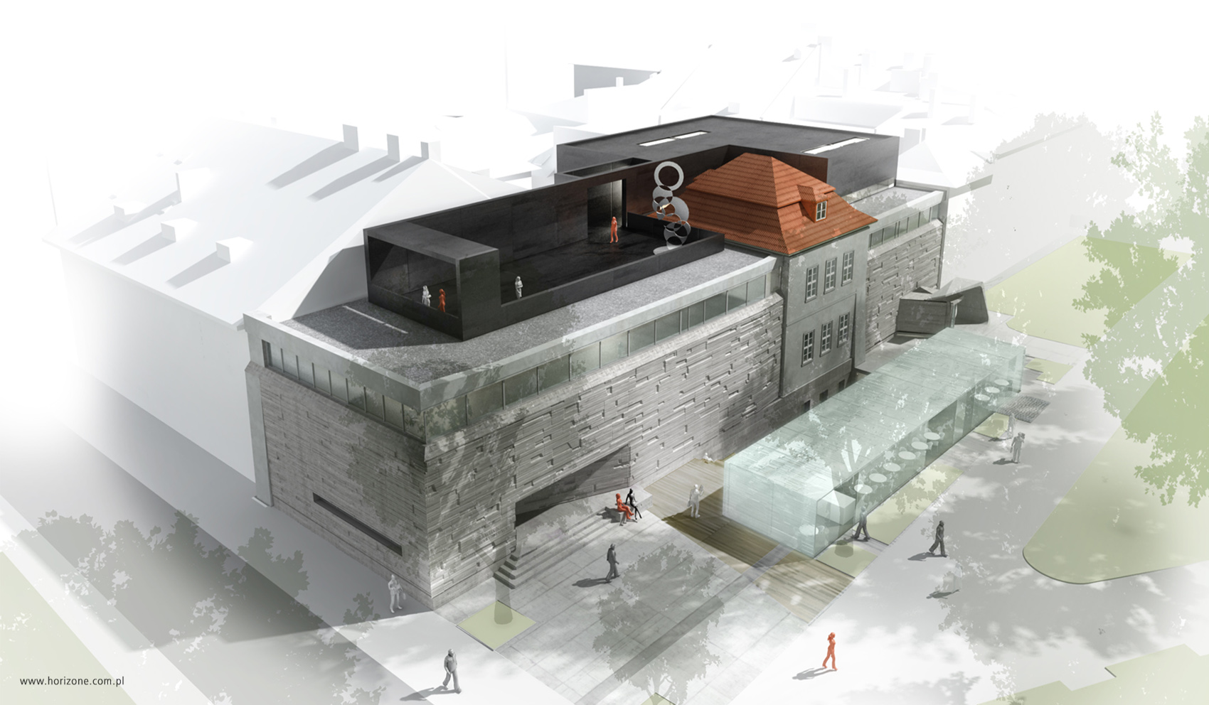
Within the project, we focused on three main design issues: reconstruction of the internal functional layout, expansion of the underground part of the building that includes a new café pavilion and the superstructure with additional exhibition spaces, which the investor plans to implement in the second stage.
The following design assumptions were adopted for the concept:
- New operations should complement the primary role of the existing Bunkier Sztuki building and should not dominate the characteristic image of the current facility, both in external and interior perception.
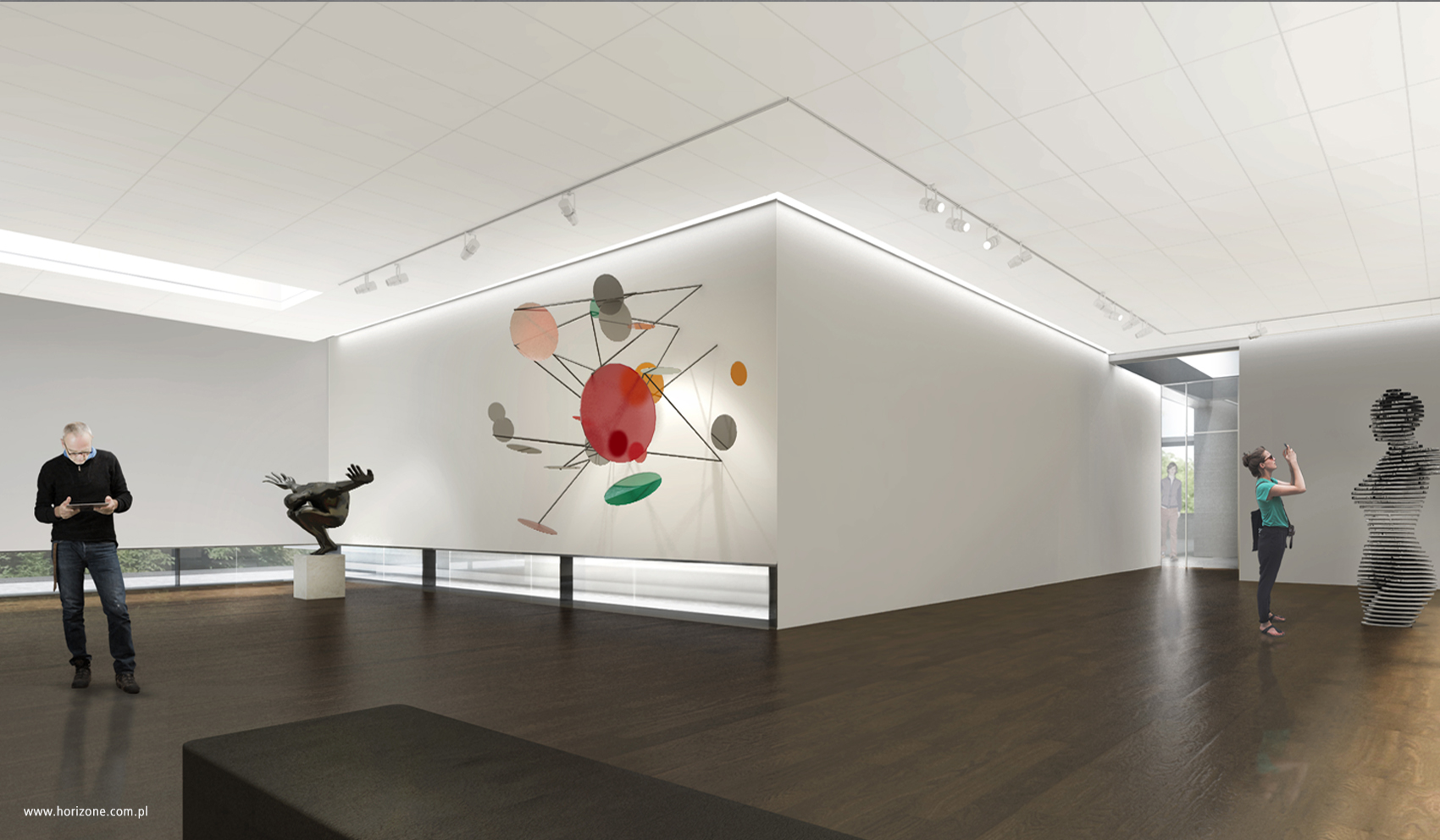
- Underground expansion and functional reorganization should be carried out with the least possible interference in the original shape of the building while adapting it to modern regulations and standards. The underground area, apart from the storage function, offers public services, including a bookstore, library, reading and conference rooms, and an audiovisual room.
- The new café pavilion is a creative reference to the characteristic appearance of the concrete facade of “Bunkier Sztuki”, giving it a contemporary, modern look. At the same time, in the orthogonal view, the café pavilion ensures transparency so that it is possible to view the facades of the existing building from the Planty side.
- Creating an attractive, intimate space between the café pavilion and the building by designing external stairs leading to the lower square, will enable an independent entrance and daylight illumination of the underground part. Some of the stairs will also function as seats, serving additional places for the café and temporarily creating a micro auditorium for multimedia presentations.
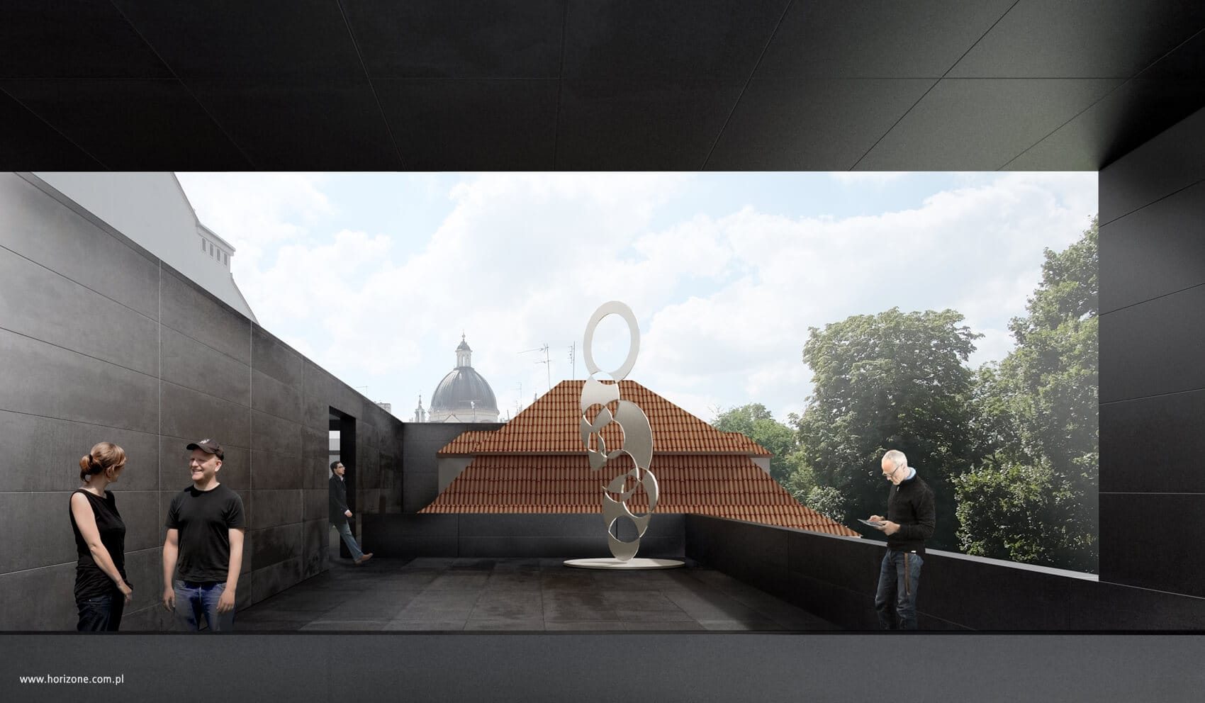
- The superstructure should not dominate over the main body of the building. Therefore, the superstructure element will be set back from the attic and adopt a neutral color scheme. The idea for the superstructure is to make all the new elements from the same material. The volume of the internal exhibition on the roof level might be extended by a multifunctional terrace, which will serve as an outdoor exhibition and a place for summer events.
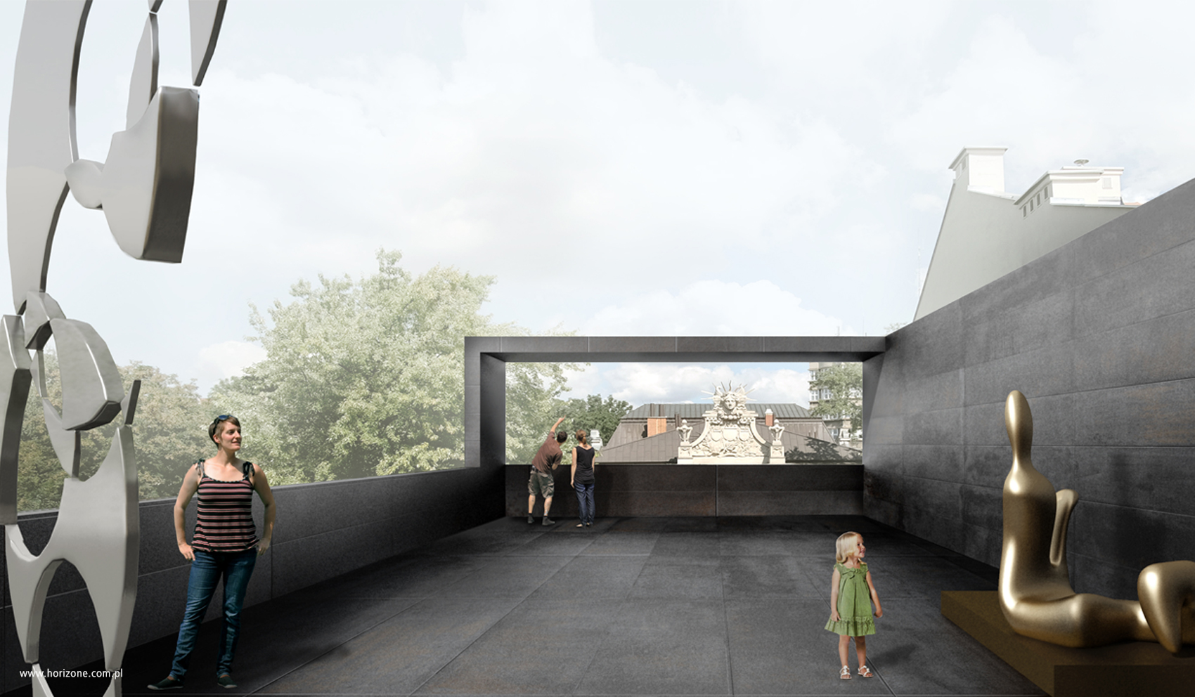
The building’s superstructure was given an unusual character. The idea of the superstructure is to add a new element to the existing structure – a volume structure integrated with an external terrace. The terrace has one wall, which serves as a background for the exhibition and separates it from the neighboring buildings. All elements placed on the roof constitute an optical unity – they are held together by the same material and color. Both the walls, the floor, the balustrades and other external elements are designed with matte black panels.
The facade of the superstructure and the full terrace balustrades were moved from the attic so that the existing gallery building with its concrete facade was visible from the street. Low lighting on the floor and skylights on the roof create an intimate atmosphere within the interior. The terrace is intended to be a multifunctional space used for outdoor exhibitions, educational meetings, vernissages and to extend the exhibition functions of the interior.
The new café pavilion was moved away from the existing facade to expose it properly. The pavilion is designed to have a light and transparent appearance. Both longer facades have sliding glass panels that allows the pavilion to be opened to the surrounding park during warm months. Transparent, movable longer facades were planned so that when walking through the Planty Park the concrete facade of the Gallery building could be seen.
One of the ideas for a creative reference to the structure of Bunkier Sztuki involves using textured glass with a repeated spatial formwork pattern from the main concrete facade of the building. These translucent glass blocks would transmit light, and at night, the illuminated pavilion would serve as an elegant accent in the Planty space thanks to its characteristic glass tectonics.


